SOUR
Package Design
Photography
Entrepreneurship


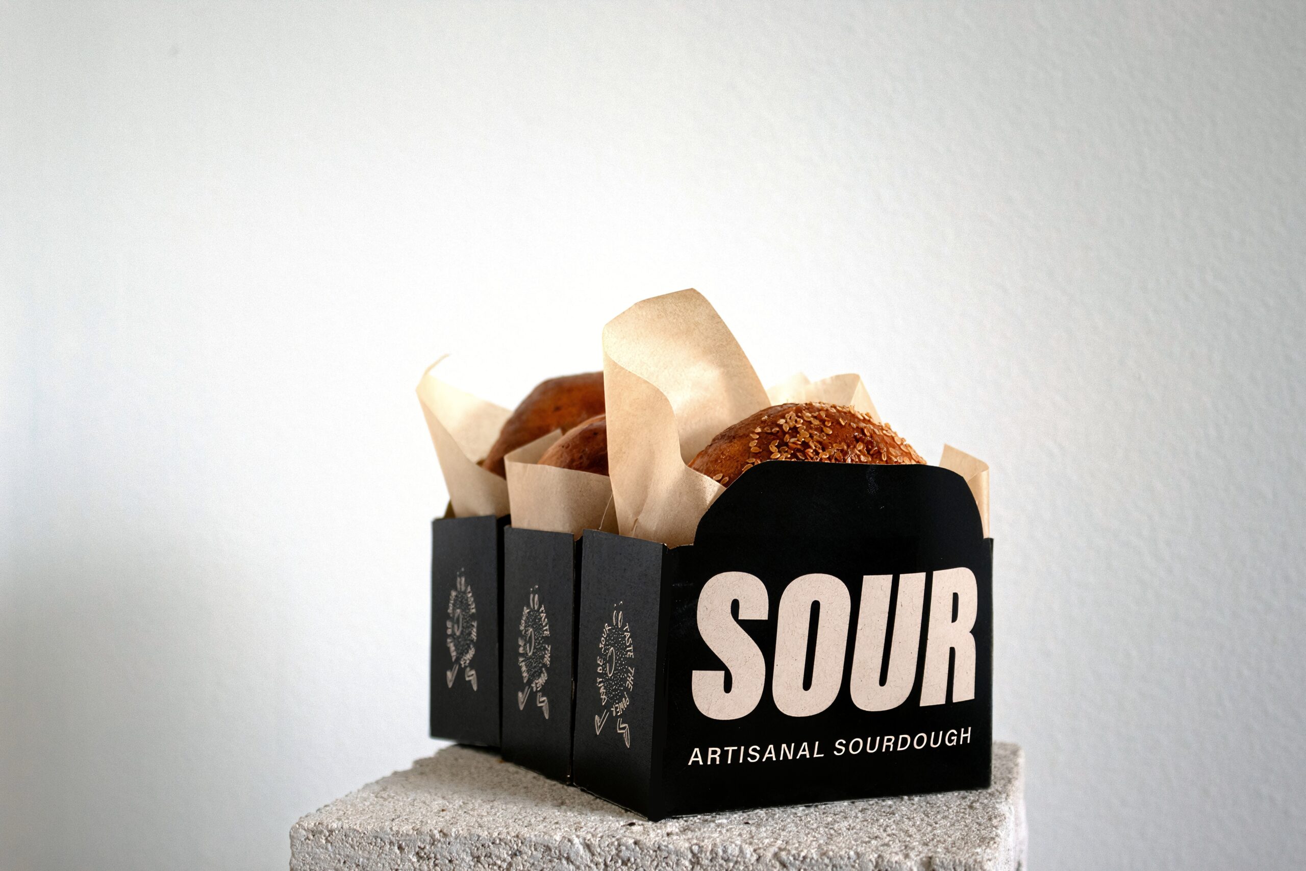
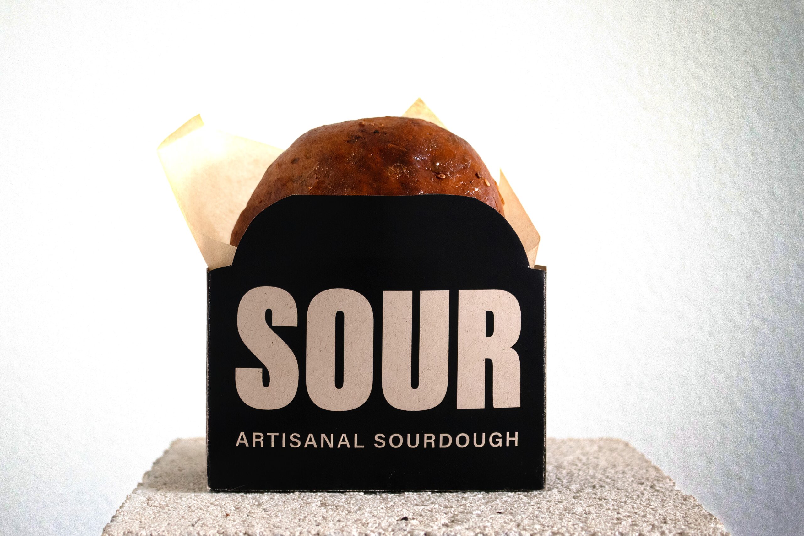
Our product line features sourdough bagels, loaves, and a discard special of the week. To highlight the discard special of the week, we use a reversed color scheme to ensure it stands out. Despite this, we’ve carefully chosen the color to remain within our minimal color palette. This decision was made to accommodate the changing graphic on the box, which showcases the weekly special. For instance, this week’s special featured cinnamon rolls. The selected color ensures that it complements every graphic SOUR chooses, maintaining a cohesive and visually appealing packaging design due to the ever changing graphics.


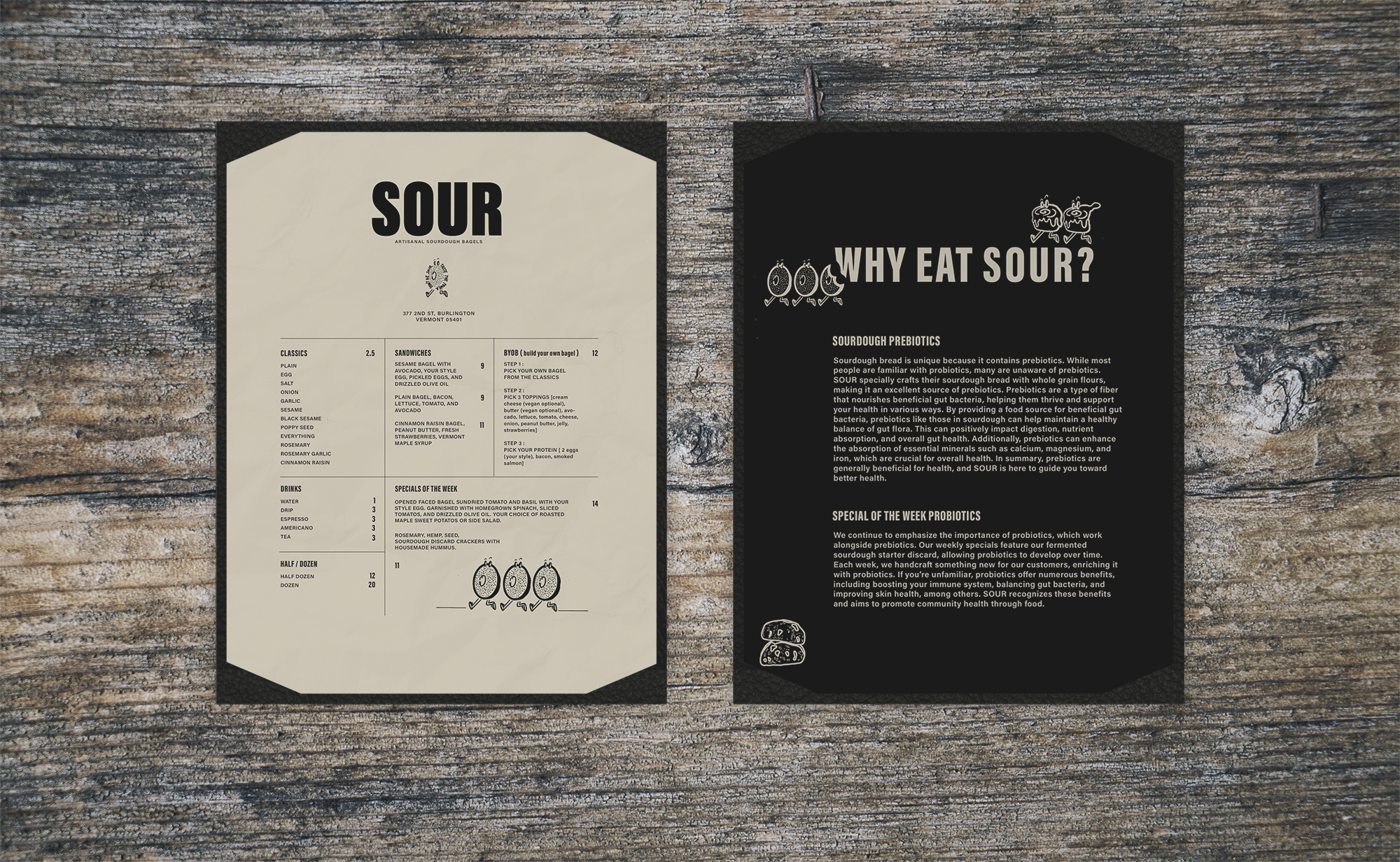
By including information about probiotics and prebiotics on our menu, we aim to educate and empower our guests about the benefits of these gut-friendly elements. We believe in fostering a deeper understanding of how food choices impact health, and by highlighting probiotic and prebiotic-rich options, we encourage a more mindful approach to dining. Our goal is to offer a dining experience that not only tantalizes taste buds but also supports overall health, promoting a lifestyle of balance and vitality.
